Home » Excel

Category: Excel

custom colour palette

Make a Colour Palette for Professional Maps, Reports, and Dashboards

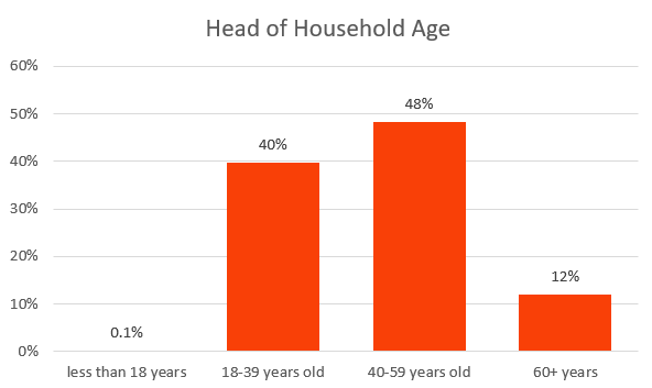
Let’s talk about the colours you use for visualizing your data!  And more specifically, about creating a colour palette to use for your visuals based on your organization’s branding colours.

Whether you’re colouring a map, or colouring charts in a report, or in Excel, or in PowerPoint, or even if you’re creating dashboards.

I’ve created a download for you, which is a template I use for creating a custom colour palette.  So go get that right away and then follow along in this video to learn all about using it and customizing it for your organization.

Colour palette maker

Humanitarian Data Cycle

As part of a normal information management cycle, after you’ve collected data and analysed it, you usually visualize it before you share it.

Tip #1: Simplify the Colours you Use

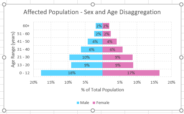
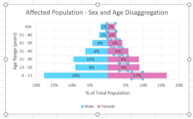
Now, one of the tips for data visualization is to really simplify the colours you use.  If you use a lot of different colours for your data, then it gets overwhelming for the reader, and they can miss the most important point of your data.  You know, most of the time I use only one colour when I’m placing charts in a report.  Which makes it easier for the reader to take in, and it also just makes it look more professional.

Tip #2: Use your Organization’s Brand Colours

A lot of organisations have some sort of a colour palette that’s linked to their branding.  To really make your reports look more professional at field level, use your organisation’s brand colours when you prepare your charts and maps.  They’ll look great when you place your logo next to them, keeping everything consistent.

But here’s a problem I always face when I create data visualisations

I have the main colour palette, but then I want multiples shades and tints of that colour to help keep a consistent colour scheme while also being able to show different categories of data.

Like in these pie charts.

Pie Charts

Or in this map.

Map

And frequently, I just need the RGB values of these colours to input into various software to create my custom colour palette.

Template to Create Shades and Tints of a Colour Palette

So…. I created this Excel template that automatically creates shades and tints for my custom colour palette, and it gives me the RGB values.

Colour Palette Snapshot

If you want your own copy, I’ve put the link here so you can go download it to use it for yourself.

So just keep this on your computer and refer to it while you’re creating visuals, or if you want, you could even print this out and pin it to your wall or something so you can easily refer to it at a glance.

Let me show you how it works

Once you download the template, then you’ll probably need to hit a button at the top to allow it to work.

Then you’ll see that at the top of the sheet is the colour palette.

Enter the RGB values of your personal colour palette in the RGB columns.  RGB stands for Red, Green, and Blue.  And the numbers just range from 0 to 255 in each column for every colour.

The template automatically creates tints and shades for you, based on that palette.

So then if you wanted to customize the colours of a pie chart you were putting in a PPT presentation, you could easily just grab those RGB values, update the pie chart, and voila, you’ve got a much more polished pie chart.

I like to choose something like 70 or 80% shade, plus the 100% colour, plus a 40% tint.  If you choose colours that are too close together, it’s difficult to tell them apart on the visual, so try to use just three or four tints and shades.

Now, feel free to customize this template!

2

You can customize it in five ways:

  1. Obviously, update the RGB values to match your custom colours.
  2. Give your colours names. This will update the headings at the top of each colour ramp.
  3. Then, if you have an extra colour, add a line.
  4. Or if you have fewer colours, delete ones you don’t need.
  5. The percentages control how much white or black are added to the colour to create shades. Try different percentages if you want.  You can see the formulas in the RGB columns link to the percentages.  So the colour will automatically update.

How Does the User-Defined Function Work?

And finally, I’ll just show you how the function works that colours the cells based on the RGB values.

If you press Alt and F11, the Microsoft VBA screen will open, and you can see that this is where the custom function and sub was created that colours the cells.

Shout out to this Stack Exchange post that I used to help me create this function.

If you’re in the main Excel sheet, you can find custom functions by opening the function dialogue box, and selecting a user defined function.

Create a Custom Colour Palette in Excel

Now, another way you could do this is to create a custom palette in Excel or Word or PPT.

Click on:

  • Design
  • Colors
  • Customize Colours
  • Choose Colours
  • Name it
  • Save

Make sure you watch the video to see it all in action!

Age Categories Bar Chart

Use an Excel Nested If Function to Create Categories

You’ve probably got a lot of population data that you’ve collected through assessments and surveys.  And most likely, you use Excel (sometimes or all the time) to analyze all that data.  The IF function in Excel is a logical expression which consists of a “logical test” and a true/false result. And you can use the Excel Nested If function to apply categories to population data.

When would you use an Excel Nested If Function?

Here are three examples of when you might want to use an Excel Nested If function:

  • Create age categories for individuals when you’ve only collected age data
  • Use a formula (like a vulnerability calculation) only for certain survey respondents
  • Apply income ranges to individual household results when you’ve only collected income data

Syntax of the basic IF function

=IF(logical_test, [value_if_true], [value_if_false])

The logical_test is most often some comparison between two values. Value_if_true is the value that will be returned as a result of the formula if the logical_test is TRUE. Value_if_false is the value that will be returned if the logical_test is FALSE.

These two values can be in any format: cell, text, number, date, time, or even another function, etc.

To create an Excel Nested IF function, if the logical_test is FALSE, we want to apply a second logical_test. In this case we will put a new IF function in the place of the [value_if_false] parameter.

Syntax is Boring – Let’s Look at a Real Example – Age Categories

In this example survey data, we have collected age data (for example, we’ve asked “How old is the head of household?”)  Here’s a small snapshot of the age data:

Age Data

If we were to show this data in a bar chart, here’s what it would look like (not super useful to anyone) – just a lot of bars:

Age HHH No Categories

Usually, you want to group the heads of households in certain age categories based on your organisation’s indicators, or based on your donor indicators.  For example, let’s use these age categories:

  • Less than 18 years (<18)
  • 18-39 years
  • 40-59 years
  • 60 years or older (>60)

If you apply the Excel nested if function to the age data using these categories, you’ll end up with this chart instead (much nicer to put into a report):

Age Categories Bar Chart

Step-by-Step: Excel Nested If Function

1. Write your first If Function

First, add a new column to the spreadsheet and call it “Age Categories”. Start out by putting a single “If” function into the top cell in this column.  Make this function check:  “if the age is less than 18 years old, then apply age category ‘<18 years'”.  You write the function like this:

Excel If Function Explanation

  • First, write an “equals” sign, then write “if” and an open bracket.
  • Next, click on the cell where your age data is held (in my example, my age data is in cell E2).
  • Then, put in a “less than” sign, put in the age 18 and a comma to mark the end of the logical test.
  • Then, put double quotations and the text that you want to apply and double quotations again.
  • Last, put another bracket to end the function:

=if(E2<18,"less than 18 years")

  • And hit enter = if your age data is greater than or equal to 18, the cell will now saw “FALSE”

Simple Excel If Function

False

2. Add a second “if function”

Right now, we’re only checking one of our age categories (we’re checking to see if the data in cell E2 is less than 18).  So, you’re going to add a second IF function to the formula to check if it’s in the next age category.

Excel Nested If Function Explanation

  • Take the formula you’ve already written.  After the second set of double quotation marks, add a comma.
  • If you hit “Alt+Enter” on your keyboard – this puts the next part of the formula on the next line and makes it easier to keep track of all the if statements in your formula.
  • Then, write “if” again, and another open bracket, and check if the age is less than 40 years by writing E2<40.  Then put another comma to end the new logical test.
  • Next, type in “18-39 years old”.
  • And then put in two closed brackets to close both if statements:

=if(E2<18,"less than 18 years",
if(E2<40,"18-39 years old"))

  • Press enter when you’re done.


One Excel Nested If Function

3. Add a third “if function”

You’re now checking if the age meets one of two age categories.  First, you’re checking to see if the data in cell E2 is less than 18.  Then, if the data isn’t less than 18, you’re using a nested if function to check if it’s ).  Now you’re going to add a third IF function to the formula to check if it’s in the next age category (40-59 years old).

Two Excel Nested If Functions Explanation

  • Take the formula you’ve already written.  After the “18-39 yrs” put a comma, and hit “Alt+Enter” on your keyboard – this puts the next part of the formula on the next line.
  • Then, write “if” again, and another open bracket, and check if the age is less than 60 years by writing E2<60.  Then put another comma to end the new logical test.
  • Next, type in “40-59 years old”.
  • And then put in three closed brackets to close all three if statements:

=if(E2<18,"less than 18 years",
if(E2<40,"18-39 years old",
if(E2<60,"40-59 years old")))

  • Press enter when you’re done.

Two Excel Nested If Functions

4. Add the last age category

Final Formula For Excel Nested If Function Explanation

For your last age category, you don’t need to put another nested if statement.  You just want to make a statement that “if the logical test is still FALSE – then just give it this leftover age category”.  We want the final category to just say “60+ years old”.  It doesn’t matter if the age is 60 or 600, it will still apply this final age category.

  • Take the formula you’ve already written.  After the “40-59 years” put a comma, and hit “Alt+Enter” on your keyboard – this puts the next part of the formula on the next line.
  • Then, write “60+ years” and leave the three closed brackets to close all three if statements:

=if(E2<18,"less than 18 years",
if(E2<40,"18-39 years old",
if(E2<60,"40-59 years old",
"60+ years")))

  • Press enter when you’re done.

Final Formula For Excel Nested If Function

5. Copy the formula down

When you hit enter after you put the final formula in the cell, you’ll see the result immediately in that top cell.

Final Result

Copy and paste (or “fill down”) the formula into the whole column of Age Categories.  Here’s a partial screenshot:

Age Data Plus Categories

6. Make a pivot table of the “Age Category” column

Pivot Table

  • Highlight the age category column
  • Click Insert -> Pivot Table
  • Press “OK” to insert the pivot table into a new spreadsheet
  • Drag “Age Categories” into the Pivot Table “Rows”
  • Also drag “Age Categories” into the Pivot Table “Values” so that it shows “Count of Age Categories”

Pivot Table Setup

7. Make a bar chart of the final age categories

Age Categories Bar Chart

  • Highlight the data from the pivot table
  • Copy and “paste as values” so the data is no longer linked to the pivot table
  • Turn “absolute” numbers into “percentages”
  • Click on Insert -> Bar Chart
  • Format the bar chart to your liking

Bar Chart And Raw Data

How to create xlsform template

How to Setup a Blank XLSForm Template

When you first start to design a digital questionnaire in XLSForm – which works for ODK, ONA, SurveyCTO, and many other mobile data collection apps – then you probably want to have a blank XLSForm template setup and ready to go.

Setting up a blank XLSForm template means that when you need to create a new survey for your team, you can get started right away.  It’s so easy, saves time, and makes your work flow so much faster!  You’ll look very professional in front of your colleagues (and your boss!).

Before we start – you can download our free template so you don’t have to create one from scratch!!Download Now XLSForm Navy

1.  Set up your XLSform tabs

Step 1 set up your xlsform tabs

  • Open a new Excel spreadsheet
  • Save it as “Blank XLSForm Template”
  • Create 4 tabs in your workbook and name them as follows
    • survey
    • choices
    • settings
    • external_choices

2. Set up your “survey” sheet.

Step 2 set up your survey sheet on xlsform template

  • In your survey tab, add all the possible column names across the first row of your sheet. Name the columns as follows:
    • type
    • name
    • label
    • required
    • hint
    • constraint
    • constraint_message
    • relevant
    • required_message
    • calculation
    • repeat_count
    • appearance
    • choice_filter
    • default
    • read_only
    • media::image
    • media::audio
    • media::video
    • body::accuracyThreshold

Download Now XLSForm Green

  • ODK keeps adding new column names to their software so that it has enhanced capabilities. Just in case they’ve added new columns recently, go check out the most up-to-date list of XLSForm column names in their documentation.
  • Set up your XLSForm template for multiple languages. In your survey tab, these are columns that can be translated into multiple languages:
    • label
    • hint
    • constraint_message
    • required_message
    • media::image
    • media::audio
    • media::video
  • If you frequently create surveys in more than one language, then amend those column names to show your primary language, and create additional column names with your language variations.
Column names (multiple languages: showing English, Arabic, and French)
Change column names with your primary language: Add new column names with your second language: Add new column names with your third language:
label::English label::عربى label::français
hint::English hint::عربى hint::français
constraint_message::English constraint_message::عربى constraint_message::français
required_message::English required_message::عربى required_message:: français
media::image::English media::image::عربى media::image:: français
media::audio::English media::audio::عربى media::audio:: français
media::video::English media::video::عربى media::video:: français
  • Now set up your “metadata” questions in your survey tab. These questions should be included on every new survey you create. That way you won’t forget to capture all the data possible about when each form was filled out and which device filled it out.
    • Under the “type” column and the “name” column, put in the following questions:
type name
start start
end end
today today
deviceid deviceid
subscriberid subscriberid
simserial simserial
phonenumber phonenumber
username username
email Email
audit audit
  • A new feature that ODK has recently added to their software is the ability to add an “audit” feature to surveys, which captures details about how a data collector moves through a form and how long each question takes, for example. In order for this piece of metadata to work, you need to be using ODK Aggregate 1.5.0+ as your server.

3. Set up your “choices” sheet.

Step 3 Set up choices tab in XLSform Template

  • In your choices tab, add all the possible column names across the first row of your sheet. Name the columns as follows:
    • list name
    • name
    • label
  • If you are using multiple languages in your XLSForm template, your “label” column can also be multi-lingual. Similarly to the “survey” tab, you can amend your “label” column name to be “label::English” (or whatever your primary language is), and then add additional columns with your additional languages.  You must spell these language names EXACTLY THE SAME as the languages you added in your “survey” tab.
Change column names with your primary language: Add new column names with your second language: Add new column names with your third language:
label::English label::عربى label::français

4. Set up your “settings” sheet.

Step 4 Set up settings tab in XLSform Template

  • In your settings tab, add all the possible column names across the first row of your sheet. Name the columns as follows:
    • form_title
    • form_id
    • public_key
    • submission_url
    • default_language
    • version
    • instance_name
    • style
  • Set up encryption for your XLSForm template next. Although many people may not use encrypted forms, my recommendation if you are collecting beneficiary data for humanitarian or development projects is that you MUST protect their personal and sensitive data, so I would recommend you always use encryption on your forms.
    • Once you’ve created your private and public encryption keys for your team/project, and have stored your private key somewhere safe (don’t share this with anyone!), then copy and paste the public key into your settings tab under the “public_key” column.
  • Enter in the URL of your server into the “submission_url” column.
  • If you’re using multiple languages in most of your surveys, then add in your default language under the column “default_language”. If your data collectors collect the data all in a local language, then put the local language name here, so they don’t have to switch languages every time they fill out a new survey form.
  • You can have a naming convention for each new survey form that your data collectors submit. Enter the naming format into the column “instance_name”
    • For example, concat(${today}, ‘-‘, ${deviceid}, ‘-‘, uuid())
  • In the XLSForm template, leave “form_title” and “form_id” blank, because if they are blank, they will automatically show the name of your saved survey form. However, you can fill in an example form title and form id in your XLSForm template to remind you what to fill in when you’re creating a new survey.
    • For example, under form_title column, type in “Title in Collect App – Bilingual – عنوان ثنائي اللغة”
    • For example, under form_id column, type in “title_in_xml_english_version”

Download Now XLSForm Turquoise

5. Set up your “external_choices” sheet.

Step 5 Set up external_choices tab in XLSform Template

  • This tab is set up exactly like your “choices” tab.
  • You only need to use “external_choices” in some surveys when you have very big lists of selection choices. My recommendation is to set it up for your blank XLSForm template, but then when you’re creating a new survey, to delete this tab if it’s not needed.
  • In your external_choices tab, add all the possible column names across the first row of your sheet. Name the columns as follows:
    • list name
    • name
    • label
  • If you are using multiple languages in your blank XLSForm template, your “label” column can also be multi-lingual. Similarly to the “survey” tab, you can amend your “label” column name to be “label::English” (or whatever your primary language is), and then add additional columns with your additional languages.  You must spell these language names EXACTLY THE SAME as the languages you added in your “survey” tab.
Change column names with your primary language: Add new column names with your second language: Add new column names with your third language:
label::English label::عربى label::français


6. Finalize your Blank XLSForm Template and save it!

Step 6 Finalize and save the XLSform Template

  • You’ve now completed setting up your blank XLSForm template!
  • Press “save” and get going on creating new surveys faster!

Download Now XLSForm Navy

53. Your Chart Is Now Finished

How to Make a Population Pyramid Chart in Excel for your Next Report

One of the best charts to make when you’re reviewing household survey results is the male/female demographics pyramid chart that looks like this:

53. Your Chart Is Now Finished

Want to know EXACTLY how to use your data to make this type of pyramid chart? Read on…

Population Pyramid Download Nowturq

First of all, you need to have data that’s disaggregated by sex and age.  What does that mean?  It means your data on your beneficiaries needs to include whether each person is male or female, and how old they are.

1. summarize your data into a sex-and-age-disaggregated summary table.

Your data should look something like this:

1. Sex And Age Disaggregated Summary Table

2. Change the “male” column of numbers into negative numbers.

Negative Numbers GIF

Your data should now look something like this:

2. Male Column Into Negative Numbers

3. Change your absolute numbers of beneficiaries into percentages of the total population.

Percentages GIF

Your data will now look like this:

3. Percentages Of The Total

Once you have your data in this format, then you can proceed to turn that into a sex and age pyramid chart.

Population Pyramid Download Nownavy

4. Create a horizontal stacked bar chart.

4. Create A Horizontal Stacked Bar Chart

5. Add the population data to your chart.

First, go to “Select Data” by right-clicking on your chart.

5. Select Data

Add your first series of data, by selecting the “Female Data”. Click on the “Add” button under Legend Entries (Series).

6. Add Your First Series Of Data

Then, for the “Series name”, select the cell with the word “Female” in it.  And for the “Series values”, select the range of cells with the percentages of females per age category, as this picture shows:

7. Select The Range Of Cells

Add a second series with the “Male” data.

8. Add A Second Series

Add the horizontal axis labels by clicking on “Edit”.

9. Add The Horizontal Axis Labels

Select the Age Ranges you want as labels.

10. Select The Age Ranges You Want As Labels

Select OK.

11. Select OK

6. Add a chart title above the chart.

12. Add A Chart Title Above The Chart

7. Add a legend at the bottom of the chart.

13. Add A Legend At The Bottom Of The Chart.

8. Add both horizontal and vertical axis labels.

14. Add Both Horizontal And Vertical Axis Labels.

9. Add data labels, centred within each bar.

15. Add Data Labels, Centered Within Each Bar.

10. Add both Primary Major Horizontal and Primary Major Vertical Gridlines.

16. Add Both Primary Major Horizontal And Primary Major Vertical Gridlines.

Once you’ve added all those chart elements, you’ll see the very rough beginnings of your pyramid chart:

17. Your Table Will Look A Little Rough

11. Modify your chart and axis titles.

Change the title.

18. Change The Title

Change the vertical and horizontal axis labels.

20. Change The Horizontal Axis Label.

12. Put the vertical axis values on the far left side of the chart.

Select and right click on the select the horizontal axis values, and choose “Format Axis…”.

22. Format Axis

Then, change where the vertical axis crosses from “Automatic” to “Axis value” = -0.2 (or whatever the lowest value on your horizontal axis is).

23. Change Where The Vertical Axis Crosses

Your vertical axis on your table should now look like this:

24. Vertical Axis On Your Table Should Now Look Like This

13. Get rid of the “negative numbers” in your horizontal axis (male values).

Select your horizontal axis.

25. Get Rid Of The Negative Numbers In Your Horizontal Axis

Format your axis “number” first by un-checking “Linked to source”.

26. Un Checking Linked To Source

Then type 0%;0%; into the Format Code box and click “Add”.

27. Type 0%;0%; Into The Format Code Box

The horizontal axis on your pyramid chart will now look like this – no more negatives!

29. Horizontal Axis On Your Chart Will Now Look Like This

14. Change your vertical and horizontal gridlines to a dashed line.

Select the vertical gridlines.

30. Select The Vertical Gridlines.

Then format the gridlines to a dashed line type.

31. Format The Gridlines To A Dashed Line Type

Select the horizontal gridlines.

32. Select The Horizontal Gridlines.

Then format the gridlines to a dashed line type.

33. Format The Gridlines To A Dashed Line Type

Now your pyramid chart looks like this.

34. Now Your Chart Looks Like This.

15. Modify the colours of the bars and the gap between the bars.

Select the female bars by clicking on them.

35. Select The Female Bars

Change the colour of the bars so that they’re pink.

36. Change The Colour Of The Bars

Now under the series options, select Gap Width and change it to something around 36% so the bars appear thick.

37. Select Gap Width And Change It

Select the male bars by clicking on them.

38. Select The Male Bars By Clicking On Them.

Change the fill colour to blue. Your pyramid chart now looks like this:

40. Your Chart Now Looks Like This

16. Modify the data labels to get rid of the “negatives”.

Select the negative data labels.

41. Select The Negative Data Labels.

Format the data labels by un-checking “Linked to source”, typing 0%;0%; in the format code, and clicking “Add”.

42. Format The Data Labels

Your pyramid chart now looks like this:

43. Your Chart Now Looks Like This

17. Switch the Legend around so it matches your bar chart data.

The legend is confusing because it shows the pink Female on the left but the female bars are on the right, and the male legend is on the right, but the male data is on the left!

To change this, right click on the chart and click on “Select Data”.

44. Right Click On The Chart

Now, click on the little “down” arrow under the legend series, and select “OK”.

45. Click On The Little Down Arrow

This switches around the legend so it matches your chart.

46. This Switches Around The Legend

18. Select all your data labels and change them to “Bold” and “White”.

First, select your female data labels.

47. Select Your Female Data Labels.

Choose “Bold”.

48. Choose Bold

Then choose “White” for the font colour.

49. Choose White

Now do the same thing for the male data labels – make the font Bold and White!

53. Your Chart Is Now Finished

19. Your pyramid chart is now finished!

Population Pyramid Download Nowgreen

*Note:  Which age categories should you use?

Every donor has their own preferred age category, and even different sectors need to have different age categories.  Here are just a few different age category breakdowns so you can see the range of donor classifications.

In the OFDA Guidelines for Proposals, they ask for age category breakdown as follows:

  • 0-11 months
  • 1-4 years
  • 5-14 years
  • 15-49 years
  • 50-60 years
  • 60+ years

In the ECHO e-single form guidelines, they ask for age and sex disaggregated data in the following categories:

  • Infants and young children (0-59 months, under 5 years)
  • Children (5-17 years)
  • Adults (18-49 years)
  • Elderly (50+ years)

In the UN System, a broad-sweep age category breakdown, seen in the 2017 Syria HRP, is:

  • Children (0-17 years)
  • Adults (18-59 years)
  • Elderly (60+ years)

If you’ve collected data on EVERY member of the household, so you know exactly how old each household member is, then it will be easy to choose any age categories you want.

If you’ve just collected data on how many males and females fall into each pre-defined category, then you’ve got to know which age categories you want to use before you collect your data!